Azure Time Series Insights is currently in public preview, and we’ve been hard at work the last couple months to help our customers better manage and find value in their time series data. Time Series Insights is a fully managed analytics, storage, and visualization service that makes it simple to explore and analyze billions of IoT events simultaneously. Additionally, it allows you to visualize and explore time series data streaming into Azure in minutes, all without having to write a single line of code. For more information about the product, pricing, and getting started, please visit the Time Series Insights website on Azure.com.
Faster root cause analysis and investigations
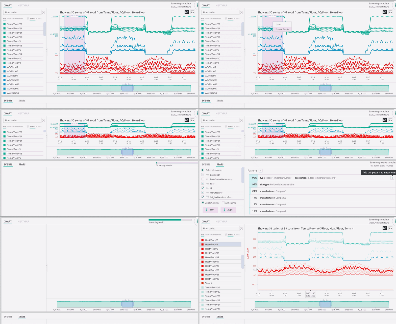
We’ve heard a lot of feedback from our manufacturing, and oil and gas customers that they are using Time Series Insights to help them conduct root cause analysis and investigations, but it’s been difficult for them to quickly pinpoint statistically significant patterns in their data. To make this process more efficient, we’ve added a feature that proactively surfaces the most statistically significant patterns in a selected data region. This relieves users from having to look at thousands of events to understand what patterns most warrant their time and energy. Further, we have made it easy to then jump directly into these statistically significant patterns to continue conducting an analysis.
This new feature is also helpful for post-mortem investigations into historical data. Most of our customers have existing alerting mechanisms in place (for example, Azure Stream Analytics jobs) and use Time Series Insights as a complementary investigative tool to understand the context of an alert. These customers are using Time Series Insights to look back during a postmortem for additional clues to help mitigate and prevent similar issues from occurring in the future.
Below is a GIF showing patterns in the stats tab and adding a pattern as a new term:

Greater control of time for data exploration
Additionally, we have heard from customers across many verticals that they are using Time Series Insights to help them triage and diagnose issues involving sensor data from their key assets, but they have been asking for finer control over their ability to navigate time in our visualizations. To give these customers more control, we have provided several new usability improvements to time navigation to make triage and diagnosing easier.
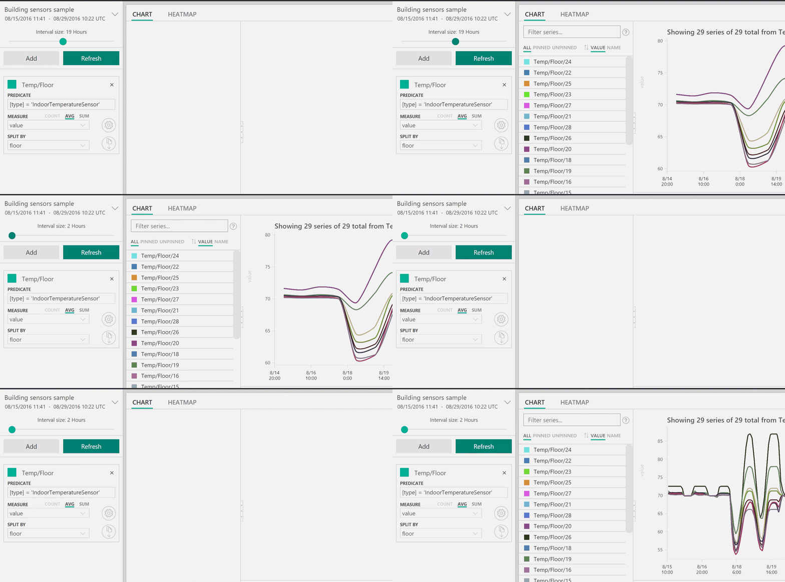
First, we’ve added a time interval slider for more precise control of movement between large slices of time that show smooth trends down to slices as small as the millisecond, allowing customers to see granular, high-resolution cuts of their data. Further, we’ve set the slider’s default starting point to be the most optimal view of the data from their selection; balancing resolution, query speed, and granularity.
Below is a GIF showing the slider in action:

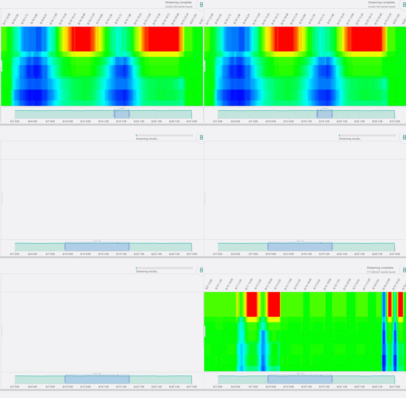
Secondly, we heard from customers that they would like an easier way to move between time ranges when conducting diagnostics on their sensor data. Previously, a user needed to leave their search and reselect the period they wanted to explore from their environment all over again to complete this task. To make their workflow more seamless, we have added a time brush to make it easier to navigate from one time span to another, putting intuitive UX front and center for easy movement between time ranges.
Below is a GIF showing how simple it is to navigate using the brush:

We are excited about these new updates, but we are even more excited about what’s to come, so be on the lookout for more product news soon! You can also explore Time Series Insights and take these new updates for a test drive using our free demo environment, you’ll just need an Azure.com account to get started. You can also stay up to date on all things Time Series Insights by following us on Twitter.
