Hello Azure friends! Today we are proud to share a new set of improvements to the Azure user experience. The changes included in this blog post are only a subset of the multiple improvements that we are delivering in this release. All these changes have been motivated by the great feedback that you have been giving us so please keep the feedback coming!
Azure user experience refresh
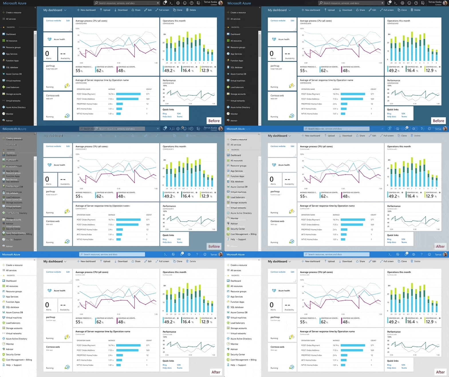
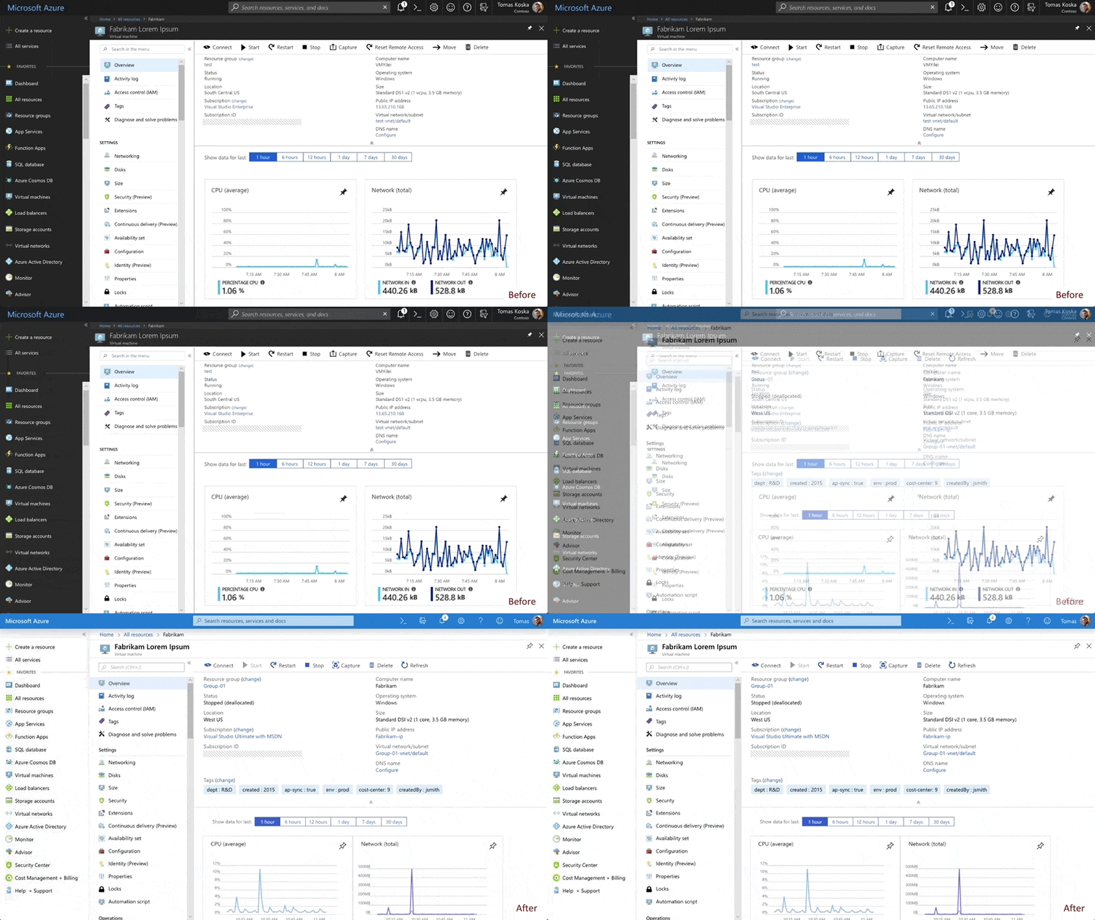
We’ve introduced modern design updates to refresh the look and feel of the portal to increase productivity, improve accessibility, and make better use of your screen real estate.
These updates have been carefully designed to address the feedback that you have been giving us. Some key improvements include:
- Improved information density and better use of screen real estate (e.g. vertical menus fit more items).
- Simplified visuals that reduce clutter, remove unnecessary lines/decorations, and create better flow between different areas in the UI.
- More intuitive organization of information.
- Better highlighting of key navigational elements like global search and breadcrumbs.
- Improved accessibility, updated colors that improve contrast ratios, and subtle updates that align our fonts across the portal.
- Support for usage over long periods of time (avoid eye-strain).
We’ve made these design updates without changing our existing interaction model, so you don’t need to re-learn how to use the product. You can continue using the patterns and interactions that you already know and love with all the benefits mentioned above. Let me know what do you think!
Dashboard and Virtual Machine blade shown before and after the update
Account, subscription, and directory management improvements
Many of you manage multiple personal and professional Azure accounts. In this release we have a preview of an experience that allows you to switch between multiple accounts in the same browser instance, as can be seen in the image below:
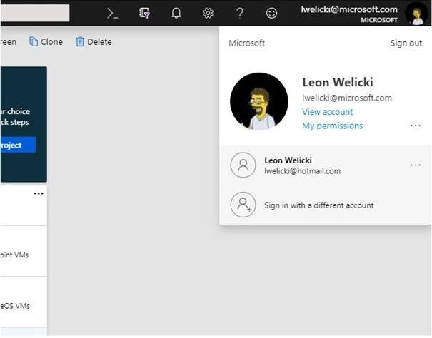
Managing multiple accounts in the Azure Portal
This experience is only available in the preview environment. Try it out and let me know what you think!
In preparation for this experience we have moved the subscription filter to the top navigation bar:
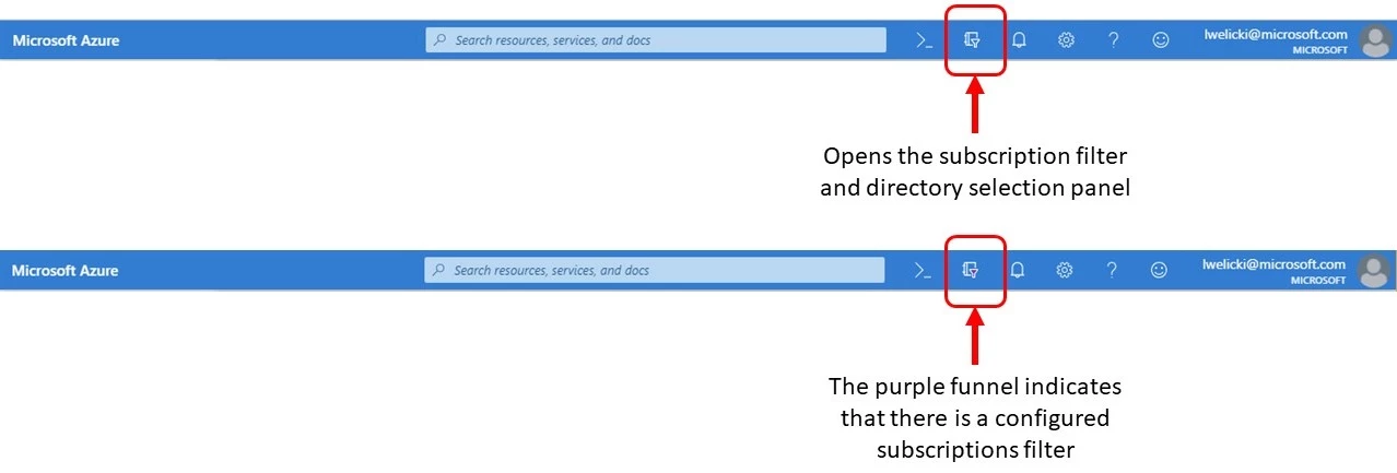
Global subscription filter and directory selection
As part of this change we have improved existing capabilities and added features that you have been asking for:
- Global subscription filter in top navigation bar.
- Configure the default directory (top ask).
- Search and sort the list of directories.
- Set your favorite directories.
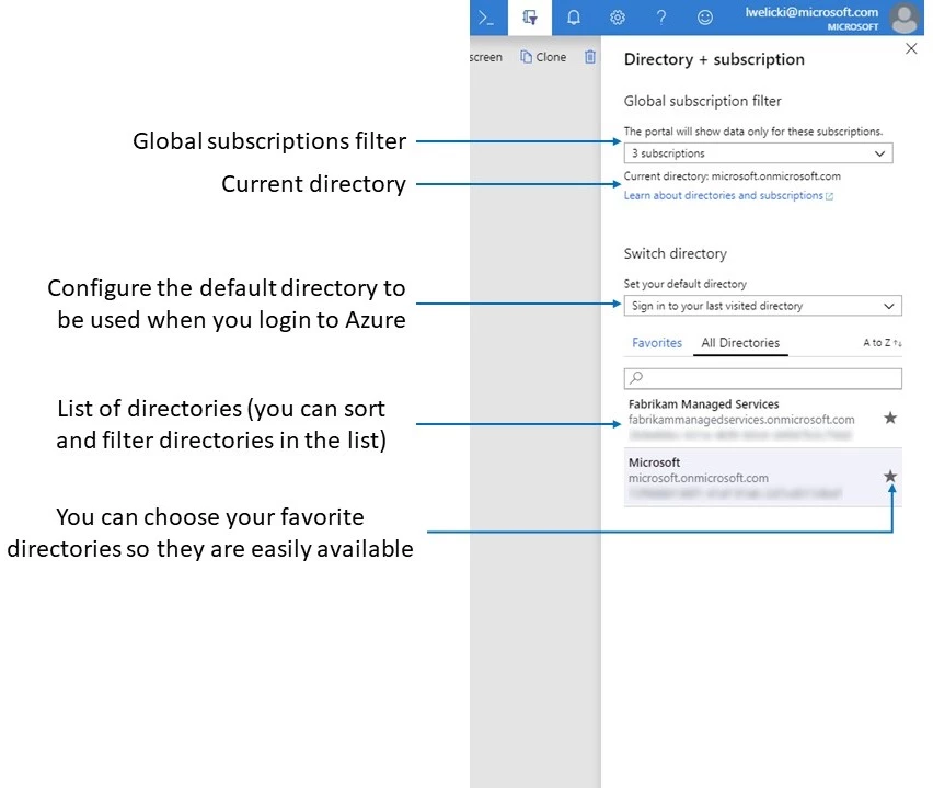
Subscription filter and directory selection panel with description of available functionality
Updates to resource creation and deployment experience
We are continuing with the simplification of resource creation started at Build 2018 with the AKS and IoT Hub create experiences. These experiences make better use of the screen real estate by reorganizing the create wizards from a vertical panel to horizontal tabs with meaningful names and descriptions. The new create experience has been designed with the following principles:
- Consistent experience across different resources, learn one and apply to all.
- Better use of the screen real estate.
- Provide a clear set of steps, each of which must have a clear explanation of expectations and link to docs to learn more.
- The first tab is always called Basic and also acts as Quick create: You can just fill out that tab and create your resource.
- Allow adding tags to the resource being created.
As a result, we expect:
- Simpler and easier to learn resource creation experiences.
- More and richer configuration options.
- Reduced time on task to create a resource. Our early iterative usability studies show a considerable increase in task completion and a decrease in time on task.
In this release we have applied these principles to Virtual Machine and Storage account creation experiences.
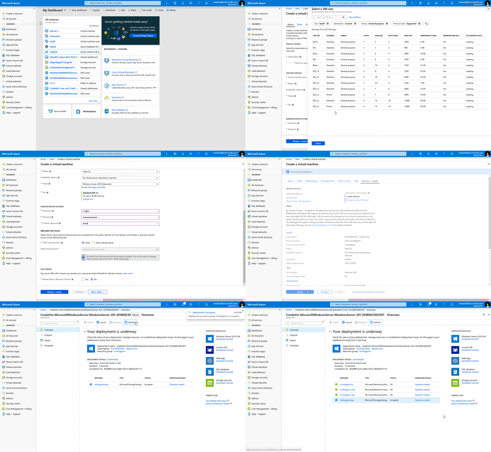
Let’s talk about virtual machines creation. In this case we not only did apply the principles mentioned above but also re-designed the flow and improved the options available when creating Virtual Machines in the portal such as multiple data disks, OS options, initialization, tagging, and more. All these new settings are optional so even though you have more control over the resource that you are creating you can also enjoy a very simple and fast experience if that is what you are looking for (quick create). The animated gif below shows how you can start deployment of a Virtual Machine in a few seconds!
Start deployment of a virtual machine in a few seconds!
Once the resources are created we introduced a deployment experience where we you can see status of the resources being created, useful information about the create operation that you are performing, and access the actual template being deployed:
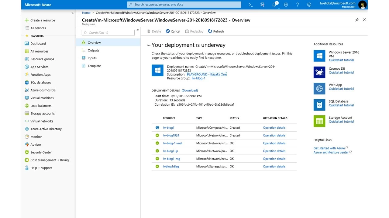
Deployment in progress (automatically shown after creation)
When the creation experience succeeds we provide a button to go to the created resource to start managing it, in this case the VM.
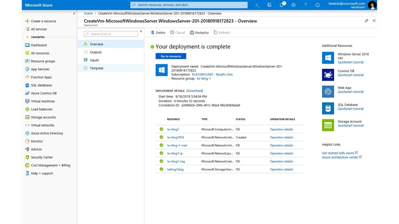
Successful deployment (notice the button to directly navigate to the resource)
When the creation fails we present you with a consistent error experience to help you understand the cause of the error and take an action. In that experience you can see a pretty printed version of the error or just see the actual JSON coming from the backed to get every single detail about the failure.
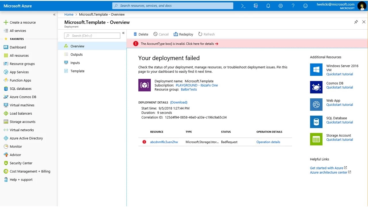
Failed deployment – Clicking in the red banner at the top opens a panel with details about the error
The Storage create experience has also been updated to a similar experience. The image below shows the storage account screen:
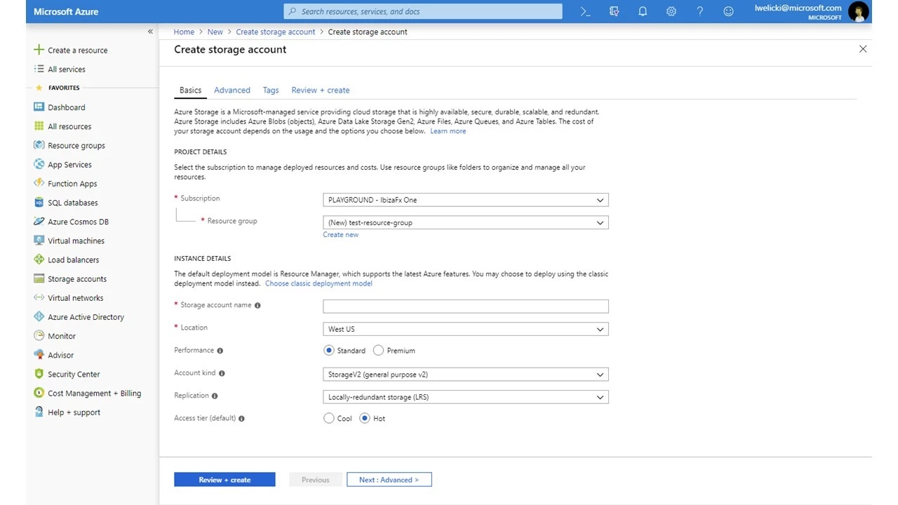
Storage account creation experience
Notifications and Activity logs
The notifications panel has been updated to improve how data is displayed in terms of information density, available data, and interactions. In addition to these changes we started on a journey to connect Notifications and Activity Logs since many entries in both experiences come from the same data source. The first step is showing a link to the activity logs at the top of the notifications list or when the notifications list is empty.
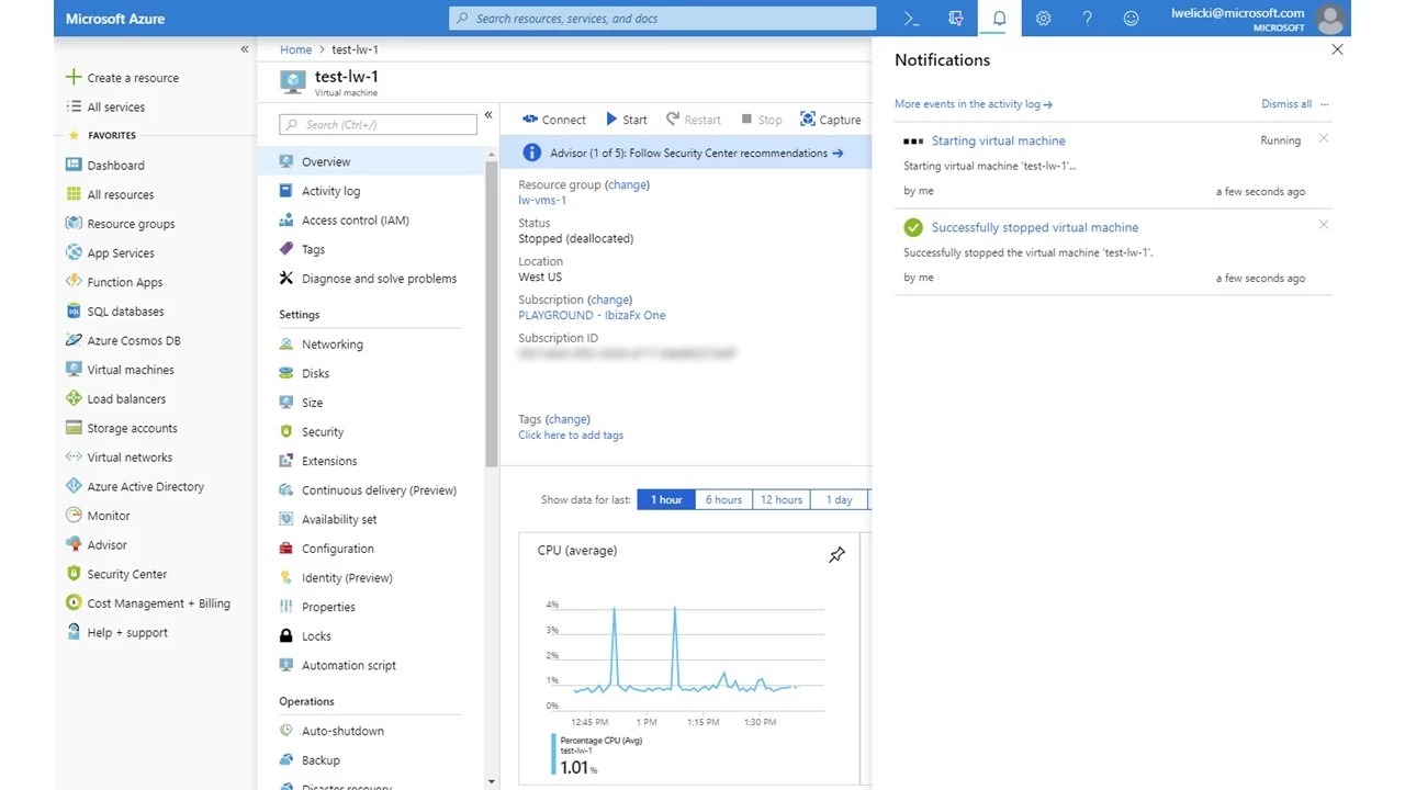
Updated notifications experience
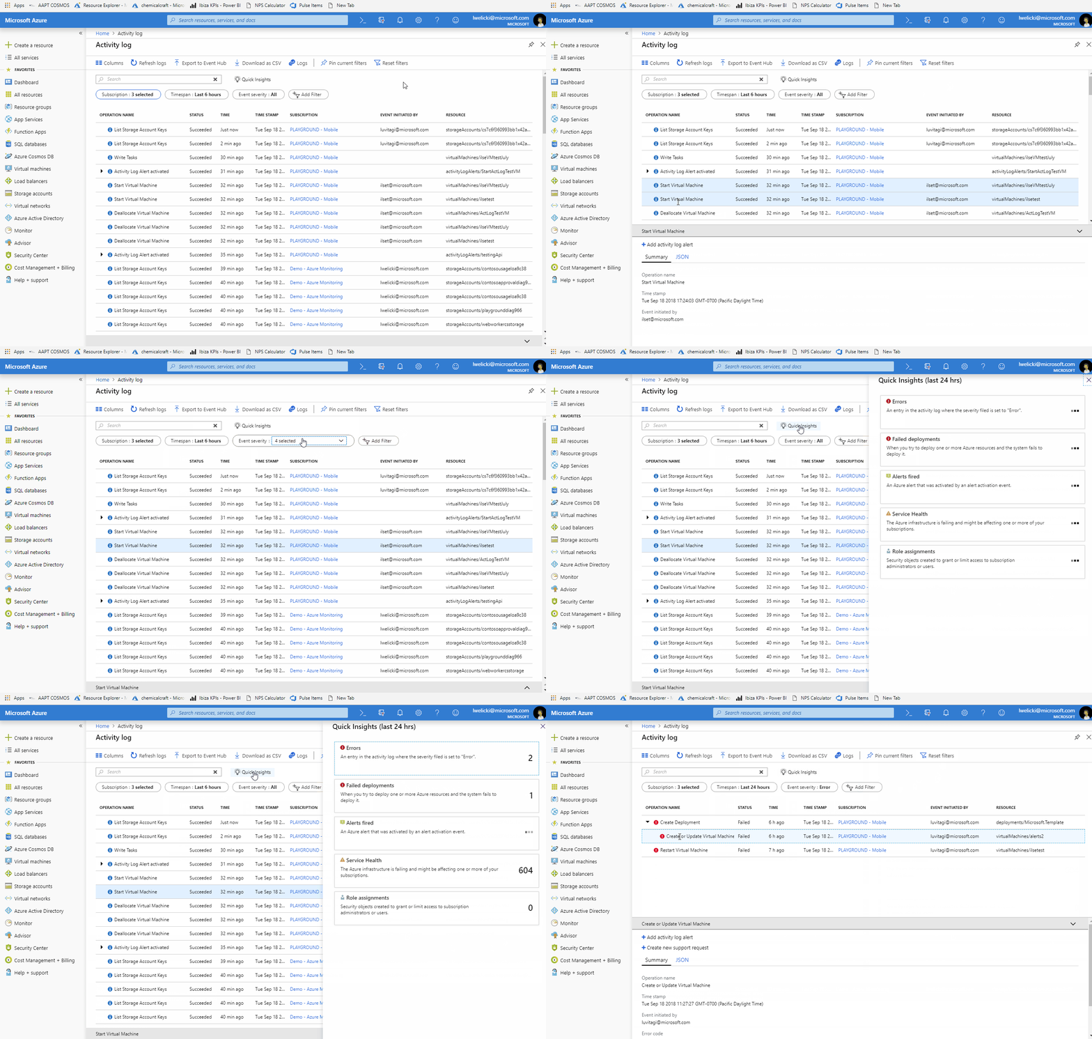
Azure Activity Log’s UI has been also improved. For people that are not familiar with the Activity Log, it is log that provides insight into subscription-level events that have occurred in Azure. This includes a range of data, from Azure Resource Manager operational data to updates on Service Health events. The new experience has been designed for productivity, use of the screen real-estate, and performance.
Updated activity log experience
In addition to looking at the logs you also can download them as CSV and see Quick insights, which is a set of well-known queries (errors, deployments, and etc.) over the last 24 hours.
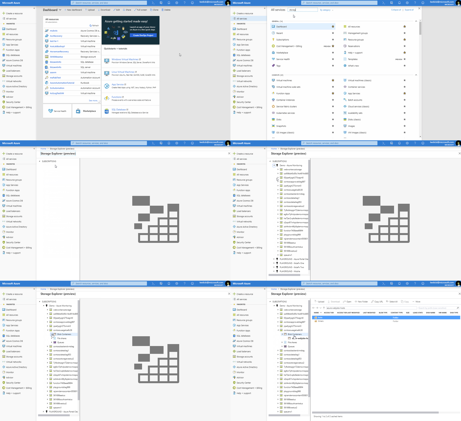
Storage explorer in Browse
Storage Explorer is now easier to find since it is available as a resource in Browse, available in the All Services list and via global search. You can now easily manage multiple storage accounts under different subscriptions in one view.
Storage explorer available in all services menu (and global search)!
Azure Advisor integration in the VM experience
Azure Advisor notifications have been directly integrated in the virtual machine overview page in the form of a status bar that when clicked takes you directly to Azure Advisor to see your recommendations and take action.
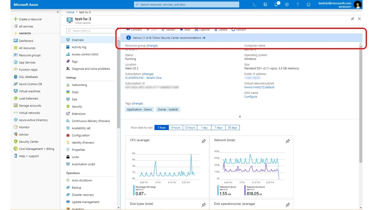
Azure Advisor in the Virtual Machine blade (blue banner at the top)
Azure Quickstart Center update
Quickstart Center is an experience that we launched as a preview for Build with the goal of helping customers that are new to the platform take their first steps in Azure. In this release we have simplified the experience based on your feedback:
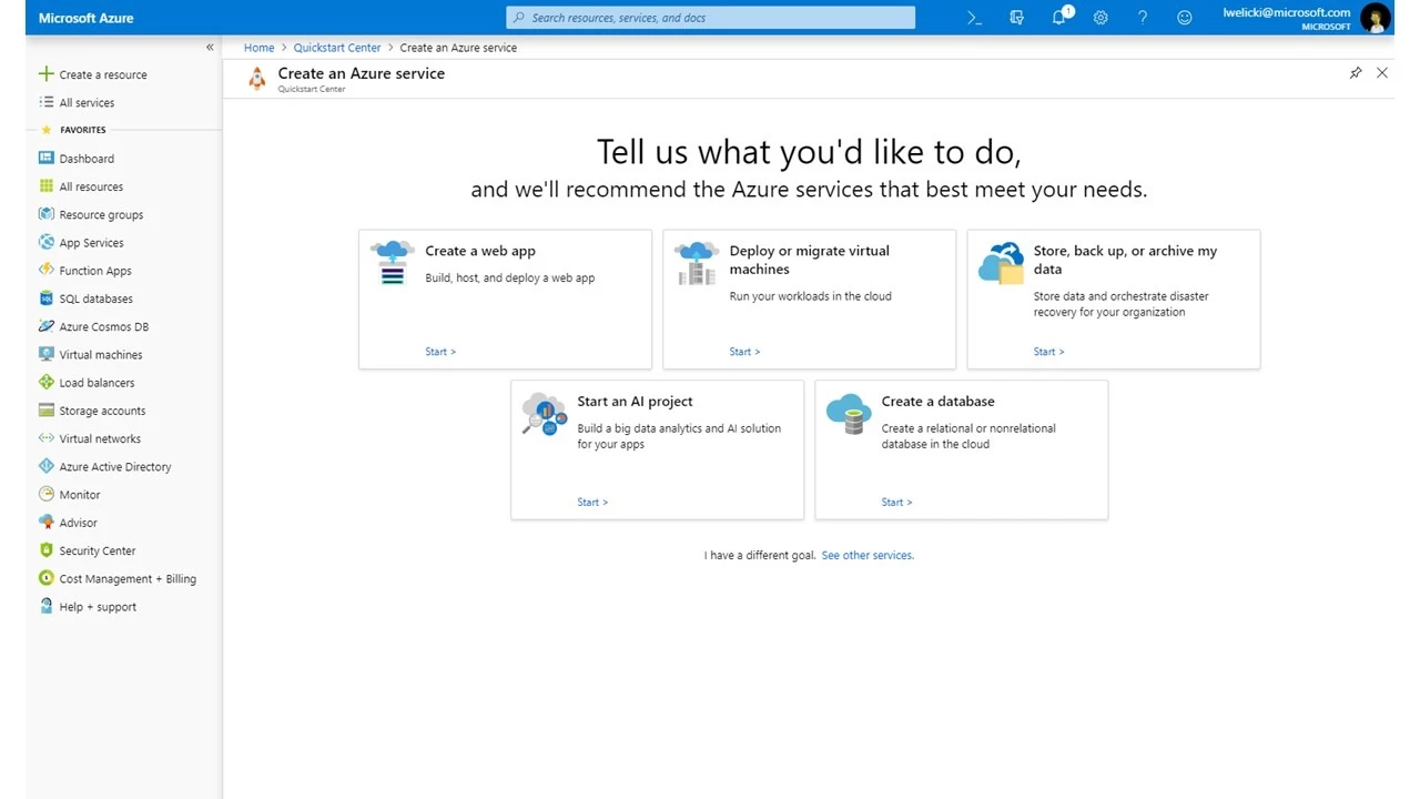
QuickStartCenter goal selection
We have also extended the features of Quickstart Center by adding playbooks, which are sets of instructions to help you set up your Azure environment with Microsoft recommended best practices and governance guidelines. We help you with topics like managing access through RBAC, organizing and tagging your resources, securing your resources, enforcing compliance, and monitoring the health of your Azure environment.
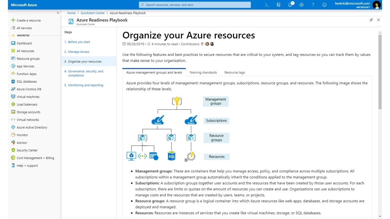
Enterprise readiness playbook
Improvements to All Resources view (preview)
Azure Resource Graph (ARG) provides a fast and rich way to query through large sets of Azure Resources. In this release we will be previewing an experience that uses ARG in the All Resources blade, one of the most popular entry points in the popular.
This new experience is not only faster and design to work with a very large set of resources but also explores different ways of navigating the results set via facets. We have also integrated ARG in the global search, so you can enjoy a faster experience when using the search bar at the top of the portal.
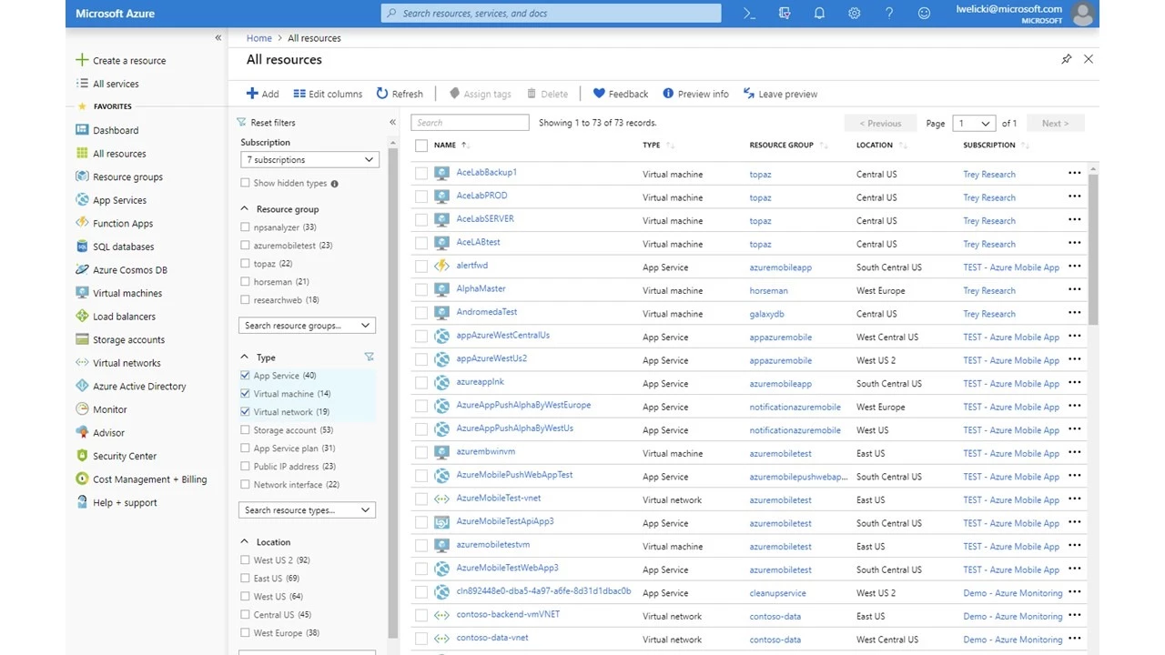
Preview of the updated all resources experience. We are experimenting with several options and your feedback will be key to help us create the right experience!
Please note that the UI for this experience is evolving. We look forward to your feedback to help us design a great resource browsing experience for Azure, so please feel free to reach out after you try this new experience and let me know your thoughts.
Improvements to the Azure Mobile App
One of our top asks has been the ability to manage role-based access control from the Azure mobile app. Giving you access to this critical function while on the go is a powerful feature. While away from a computer, a user may not be able to take care of all mission critical scenarios—but by having the Azure mobile app, they will be able to give coworkers the authorizations they need to take care of any situations that may arise.
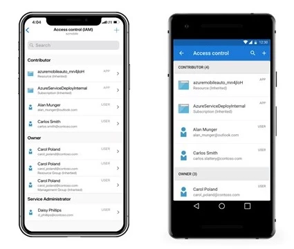
BAC in Mobile (iOS and Android)
Let us know what you think!
We’ve gone through a lot of new capabilities and still did not cover everything that is coming up in this release! The team is always hard at work focusing on improving the experience and is always eager to get your feedback and learn how can we make your experience better. Feel free to reach out directly to me at lwelicki@microsoft.com with your feedback or any thoughts about Azure user experience.
Let’s work together to build the best cloud experience!

