
FabCon and SQLCon 2026: Unifying databases and Fabric on a single data platform
We’re bring attendees together to share real experiences and solve challenges side-by-side. Only together can we move into meaningful results.
We’re bring attendees together to share real experiences and solve challenges side-by-side. Only together can we move into meaningful results.

Microsoft is honored to be named a Leader in the 2025–2026 IDC MarketScape for Unified AI Governance Platforms, highlighting our commitment to making AI innovation safe, responsible, and enterprise-ready.
Azure AI Foundry brings together security, safety, and governance in a layered process enterprises can follow to build trust in their agents.
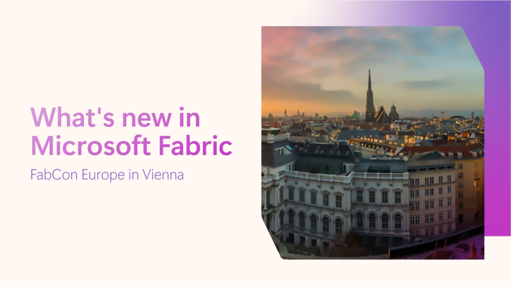
Learn about the new features and enhancements announced for Microsoft Fabric at FabCon Vienna 2025
Choosing Azure Databricks can streamline your entire data lifecycle within a single, scalable environment.

Forrester Research shows how Azure helps enterprises scale generative AI securely, overcoming infrastructure and compliance challenges to unlock real business value.

This blog breaks down the available pricing and deployment options, and tools that support scalable, cost-conscious AI deployments.
This week at SAP Sapphire 2025 we are excited to share several new announcements and key strategic updates from Microsoft and SAP for our joint customers.
In this blog, I’ll cover the latest slate of announcements across Microsoft Fabric and the entire Azure Data portfolio, designed to empower every developer on the planet to do more with data.

We’re thrilled to announce the general availability of Azure Storage Actions, our fully managed platform that transforms how organizations automate data management tasks for Azure Blob and Data Lake Storage.
In a data-driven world, you need an efficient way to harness your data for actionable insights and gain a competitive edge. Azure Databricks is a powerful, unified analytics and AI platform that streamlines the entire AI project lifecycle—from rapid experimentation to production deployment.

We are excited to share the first models in the Llama 4 herd are available today in Azure AI Foundry and Azure Databricks, which enables people to build more personalized multimodal experiences.